
Every year I wait anxiously for the announcement of the Color of the Year by Pantone. Its almost as exciting to me at who wins Entertainer of the Year! Why does it matter and how do I use the information? Well, it is the main influencer of all product development in fashion and home. For me, it is a guide for all my Interior Design Consulting, product selections and purchasing decisions. I am always questioning the decision but lo and behold that color makes its way into my own home somehow every year! Two years ago, I used Urbane Bronze in my garage to paint all the walls so you can’t see cobwebs. Ha! Designer secret… Last year I needed my Living Room painted and I chose Evergreen Fog before they even announced it! This year I had selected a color that is a brownish red for my Dining Room and guess what the color of the year is?
Viva Magenta! What is Viva Magenta?

“It is a shade rooted in nature descending from the red family and expressive of a new signal of strength. Viva Magenta is brave and fearless, a pulsating color whose exuberance promotes a joyous and optimistic celebration…. it is a color that is audacious, full of wit and inclusive of all” It is positive and energetic! Pantone.com
All the Paint manufacturers then started to follow suit with their OWN colors of the year. I know it is super confusing… even to me! Paint companies want to sell paint, Pantone doesn’t sell paint but is the predictor of everything that is produced! That is why we have all these new colors popping up. Keep reading as I show you all of the colors and at the end, I will let you know how to utilize these in your home specifically!
Spanish Moss by Krylon- A deep shade of Hunter Green to me! This is a SPRAY Paint… and a first for me to see Krylon paint coming out with their own color for the year. This is “a natural hue that brings the poetic expressions of nature into the home… a nod to all things vintage, the familiar yet inspirational color balances cool and warm accents to seamlessly support the transition between different styles—both old and new”

Raspberry Blush by Benjamin Moore- Benjamin Moore is bringing out the Orangey Reds. I am not sure what is raspberry about it though… just my opinion. I like the color in small doses, but you will not see me putting this on anyone’s wall anytime soon! “Never a backdrop, Raspberry Blush is the definition of charismatic color. This unapologetic shade of red orange had us thinking bold, bolder, boldest “

Terra Rose by Dunn and Edwards- for those of you who remember...dusty rose?! This color "is a deep rosy pink hue with a touch of terra-cotta influence that exudes confidence, creativity and coziness. Reflecting just the right amount of introspection, the high chroma cinnamon rose huse is strong, yet approchable, and acts as a refreshing neutral update to browns and burgundies."


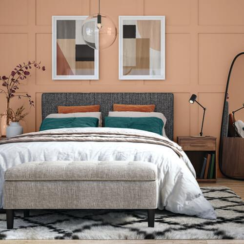
Redend Point by Sherwin Williams- here we are again… a lighter dusty rose, I see you 1990!! I’m just really not a fan of this color. I am trying hard to like it though. Maybe by mid next year I will feel different about it. It does go with grey and I can see it in small doses being very classy in pillows or throws. I would NOT paint my kitchen that color though! This will be dated in 5 years!

Redend Point goes well with the next color I am about to announce. See how these mingle well with grey?!
Vining Ivy by Glidden- Love this color! I am sitting in my home office looking at the color on my walls and this is a total match! Good job Glidden! I love how the Blue and Greens are mixed in this paint. I could live in this room!

And finally the lighter brighter colors…
Rustic Greige by Dutch Boy- This color is totally a grey/ beige balanced color. If you don’t like to change your interior around too much this color will span the test of time well! Okay so this photo cracks me up! I am seeing Evergreen Fog color on the trim and redend point on the furniture. Its funny how you will start to see these colors more and more.

And NOW for my BIG ANNOUNCEMENT!!
London Fog by Melinda Peters Elliott, Yep! I have my own paint color now! I am so freaking excited about this! My paint is available for purchase now in my gift shop! Call me for more information! A great balanced color between beige and grey but lighter. I feel like this color can be put anywhere! New home, use this! You will not go wrong.

So! Now what?! How do you use any of these in your home?
Well, the obvious is paint your walls. I am a firm believer of living with colors you love! I personally love dark base colors. Always have. I know I seem like an old soul in that manner but that is what I like to live with. My clients have all their own personalities in their homes too. If they are wanting light and bright, that is what I choose for them! If they like southwest shades, they get it! I will actually look at colors in their existing furnishings and even their closets to select the perfect shade of paint, taking into consideration these colors of the current year, but sometimes tweaking it lighter, darker, greyer, depending on their home.
Another thing you can do with these colors are integrating them in your home in accessories. Rugs are very easy to change out as well as pillows! We will also make custom window treatments in the colorways that are current for our clients, which are the icing on the cake for any home! I also love to add new towels in the powder rooms and dish towels in the kitchen!
Take some time to look around your home. Once the holiday decorations come down, you will have a cold, blank slate! Pick one or two rooms to add something new and start looking around. What colors satisfy you?! What colors make your house a home. If you need help adding any of these colors in your home, call us! My design team is ready to Elevate Your Space!
Happy Designing!